PeopleGrove Project
PeopleGrove is an online platform that connects students and alumni with mentors and other professionals to support career development. PeopleGrove offers hundreds of scholarships, volunteer opportunities, experiential learning, internships, jobs, and events.
PeopleGrove’s ultimate goal is to help students and alumni succeed by connecting them to the people and opportunities they need to grow academically and professionally. My task was to conduct user research, create UX artifacts, and build a wireframe to help the PeopleGrove platform succeed on mobile devices.
Overview
UX Researcher/UX Designer
Research, Iteration, Design
Role
May 2026
Background
PeopleGrove began as a final academic assignment for my capstone project. The assignment challenged me to conduct user research, identify the problems with the platform, and find a reasonable solution to benefit those using PeopleGrove.
I chose to focus on the usability and accessibility of the website, intending to create a more simplified, empathetic platform overall. Although this project took place in an academic setting, I was determined to push myself by conducting beneficial research, creating supportive artifacts, and designing a solution that users actually need.
Understanding the Problem
To understand the problems of PeopleGrove, I conducted interviews with users who were familiar with the platform. From this research, I found a few key pain points that many users were experiencing:
The platform is not user-friendly on a mobile device
The platform is very complex and not easy to navigate through; information feels scattered
There is no clear indicator of where to start on the website
Connecting directly to professionals is a difficult and uncomfortable process
Although there are lots of opportunities, the website itself relies on a lot of technological parameters
Not all opportunities provide the same information, making it difficult to search or compare various listings
The Problem Statement:
Students and alumni find that PeopleGrove is very challenging to navigate as information feels scattered, there are too many technological parameters, and the general process is overly complex. This leads students to become frustrated, overwhelmed, and stressed. Without clear navigation and accessibility features, students are not able to uncover new opportunities that may change their lives or support their career goals.
Key Insights
Key Insights from the research include the following:
Emotions drive decisions.
Students will make a more informed decision when they do not feel overwhelmed or frustrated.
Inconsistent information.
Users find a sense of familiarity in patterns of the interface and expect it when entering a platform.
Importance of connection.
Students want someone to talk with who has more experience and can guide them when making large decisions.
Complex navigation.
Students desire an easy way to look through opportunities for the future, without it being complicated or frustrating.
Research Artifacts
Based on the problem statement and the insights above, I centered my main focus on the navigation and usability of the platform. The first step in working toward my goal was creating a user persona.
The typical user of the platform is a college student looking to further his or her experience and grow career skills. My persona encompasses the typical user presented through Melvin Chark.
Successes:
I enjoyed creating a user persona for one of the main users of the platform.
It helped me understand the problems users were facing in a more empathetic manner, thus allowing me to want to help more.
Challenges:
I struggled with what elements I should include in my user persona. After looking through some examples, I was able to find a balance of demographic details and explanations as to what the user is trying to accomplish.

After creating my user persona, I used that artifact to aid in creating the next one: an empathy map. My empathy map shows some of the things Melvin might had said, felt, thought, or done when navigating through PeopleGrove.
Successes:
I enjoyed the visual aspect of creating the empathy map.
Through this, I was able to connect more with the users and start planning toward an effective solution.
Challenges:
I found it difficult to create an empathy map, as I was not confident in figuring out what the user may have been thinking, feeling, doing, or saying when interacting with the website.

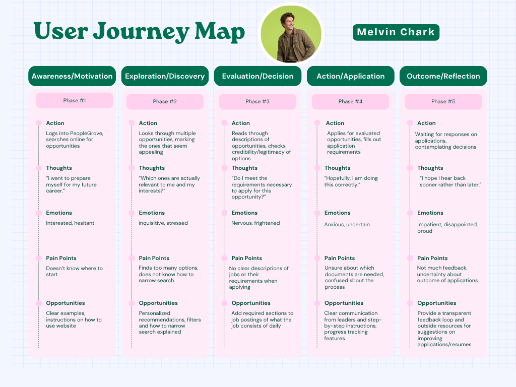
My next task was to create a user journey map. The map goes through different actions, thoughts, emotions, pain points, and potential opportunities for improvement as Melvin uses PeopleGrove.
Successes:
I was able to think more critically about the problems the users were facing, and what I could do to help PeopleGrove succeed.
Challenges:
I initially debated whether to create a user journey map that took a closer look at the technical navigations of the site, but ultimately decided to go with a user journey map that encompassed a broader approach; a user will likely not attempt to apply strong filters and parameters on their searches if they cannot figure out where to start on the platform.
I was challenged through the path the user might take, and how I would effectively communicate that through my user journey map.
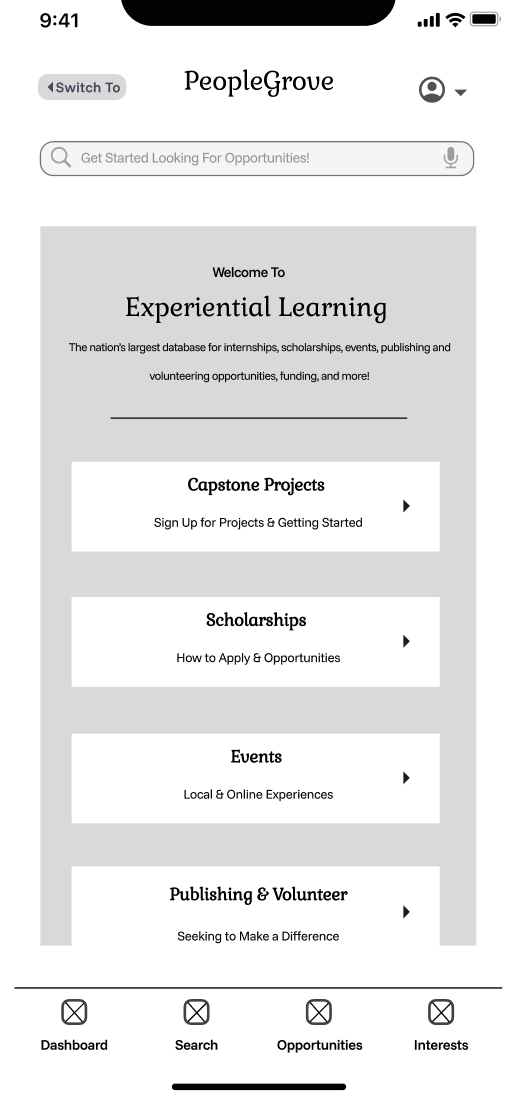
Wireframing the Solution
With all the research elements complete, I was able to start designing a low-fidelity wireframe for the homepage of the mobile app for PeopleGrove. I used Figma to design my wireframe, and used some common interaction elements as I continued to iterate.
Successes:
I went through a couple of different iterations, but ultimately settled on one that simplified the navigation process and made it clear to the user where to start.
I wanted to emphasize how PeopleGrove offers experiential learning, and I centered the rest of my design around that point on the homepage.
Challenges:
I initially struggled with the layout, but after looking at some other common designs, I was able to create a homepage that has clear navigation and works for a mobile design.
This project significantly strengthened my skills in researching, developing UX artifacts, and applying my findings to a low-fidelity wireframe. I learned that conducting accurate user research is the foundation for creating a solution that will be effective. I also learned how a platform cannot function on interface design itself, as it needs the proper systems to support a positive user experience. Throughout the course of this project, I uncovered the importance of identifying major problems, using empathy to connect with the users, and how perseverance is vital when iterating on designs and the UX process.
If I continued this project, I would design wireframes for other pages of PeopleGrove, implementing a mobile platform that is accessible and easy to navigate for all users. I would continue to develop a product that would integrate clear communication, familiar user interface patterns, and a sense of community for all students using PeopleGrove. Ultimately, this project helped me practice the skills needed to take complex insights and turn them into a meaningful solution.